European Commission

We worked alongside the scientists of the Joint Research Centre of the European Commission, by bridging the gap between the science and public perception, creating some illustrative and well-thought-out infographics to accompany the scientific results of a research project.
On the first day of the workshop, we met the researchers of the JRC, introducing them to the basics of graphic design, colour, typography, composition, and we helped them get some familiarity with the design software used in infographics. We were really happy to see the room full of people engaged in the creative problem solving processes that design requires, and by the end of the day, we helped inspire a room full of people who didn't think they were creative, to get a good grip with the fundamentals and be ready for the design challenge of the next two days.
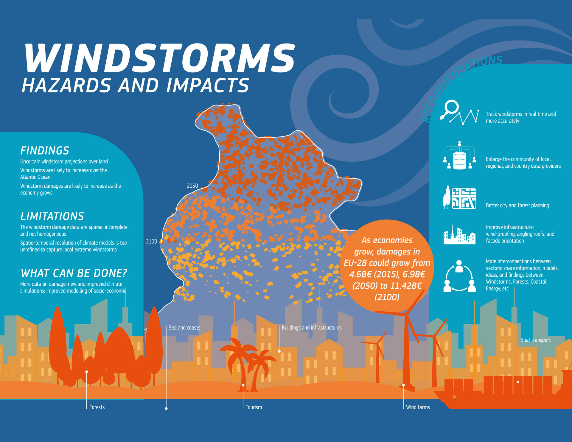
The second stage of the infohackit workshop, taking place in days two and three, was the design of twelve infographics, that would serve as chapter introduction to the publications of the project. Each of the designers in the room would be the creative director of a team of five-six people, and each team would be responsible for the production of two infographics.
In the end, both of our infographics were designed to the highest standard, delivering the key messages to our audience, representing the science accurately, while on the same time using our scientists' newfound design skills, keeping them involved in the process.
We closed the workshop with every team presenting their work, happy that we had helped out in such a meaningful and important project such as this, with a room full of researchers now more confident and more competent on their visual communication, that is definitely going to help in our collective effort to protect out environment.